
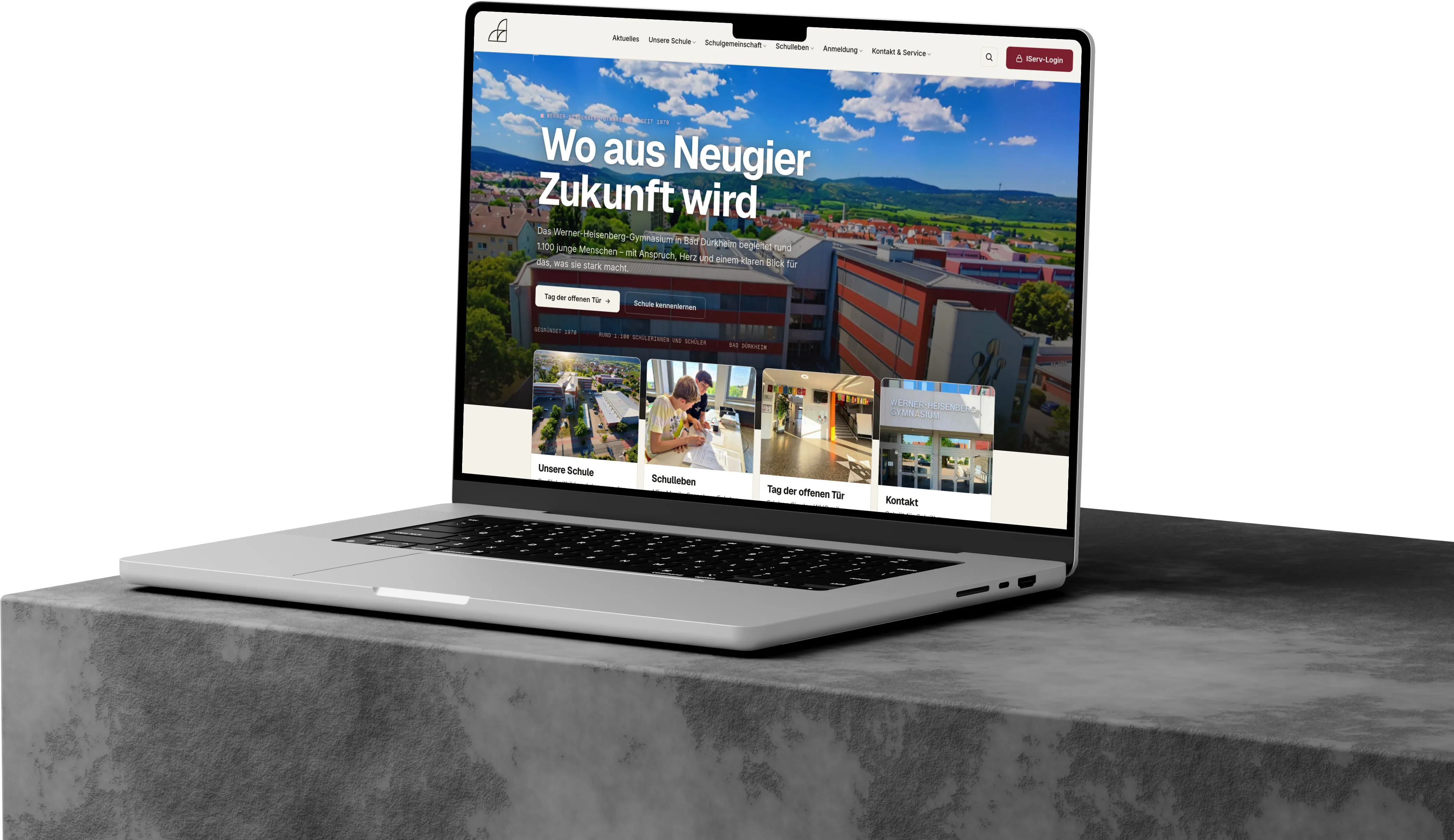
- Commission
- Complete rebuild of the school website
- Scope
- Concept, design, development, content migration, training
- Stack
- WordPress · Custom theme · Vite · Tailwind
- Year
- 2026
- Package
- Plus →
Starting point
The task
A school website is rarely “just” a website. It is a showcase, a decision aid and a service portal at the same time: parents form a first impression before choosing a secondary school, families look for dates and forms – and in the background the whole thing has to be maintainable by teachers who have neither the time nor the technical background for it.
The previous website ran on an ageing system and no longer lived up to this – neither in design nor technically, and certainly not in terms of data protection, loading time and mobile use.
- A modern, high-quality presence – calm, warm, serious instead of playfully colourful
- Easy maintenance by the editorial team, without HTML and without fear of breaking something
- Data protection at school level – photos of minors, external embeds
- Speed and accessibility as a matter of course, not as an extra
- Transferring the content of the old website into the new structure in an orderly way
Attitude & implementation
The way
I did not go into the project with an off-the-shelf toolkit but with an attitude: the website should feel calm and editorial – more magazine than brochure. Substance over effect. And yet with a signature that is recognisably its own.
That became a warm, restrained design language: paper white, a darker stone tone for rhythm, a deep wine red as accent. Clear typography, consistently calm movement – slow, soft transitions instead of hectic on and off.
Instead of a bloated universal theme, a custom WordPress theme emerged – nothing more than the school really needs, but exactly that, done properly. And I measured every decision against one question: can a teacher maintain this later without asking me?
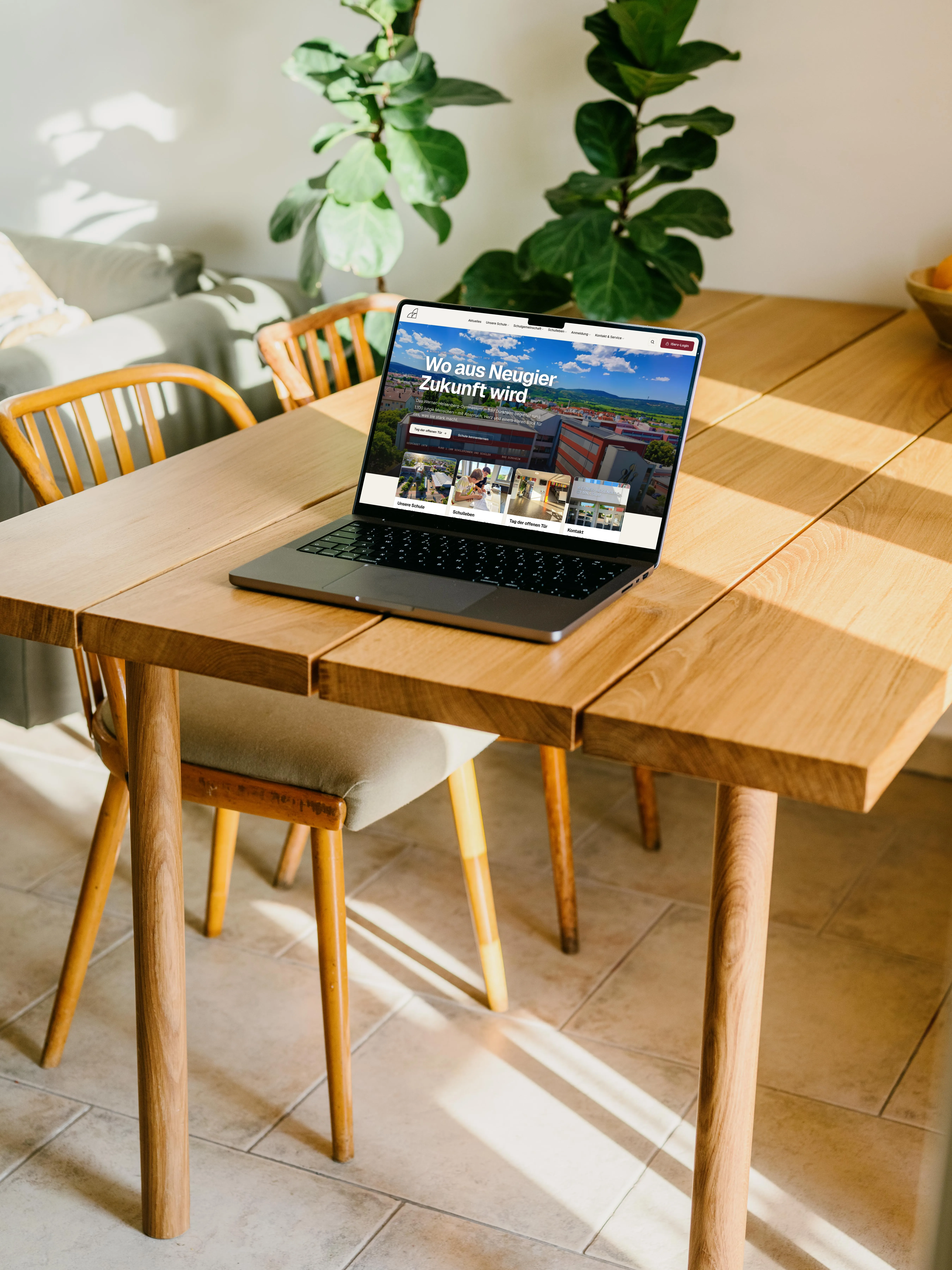
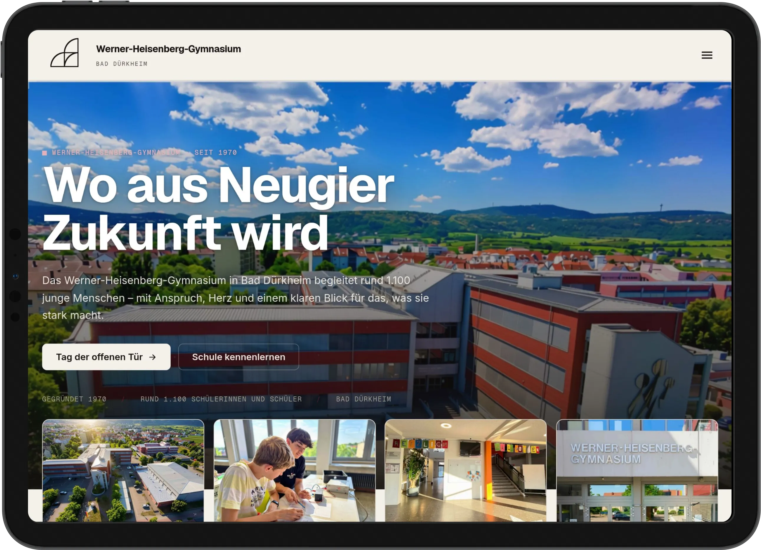
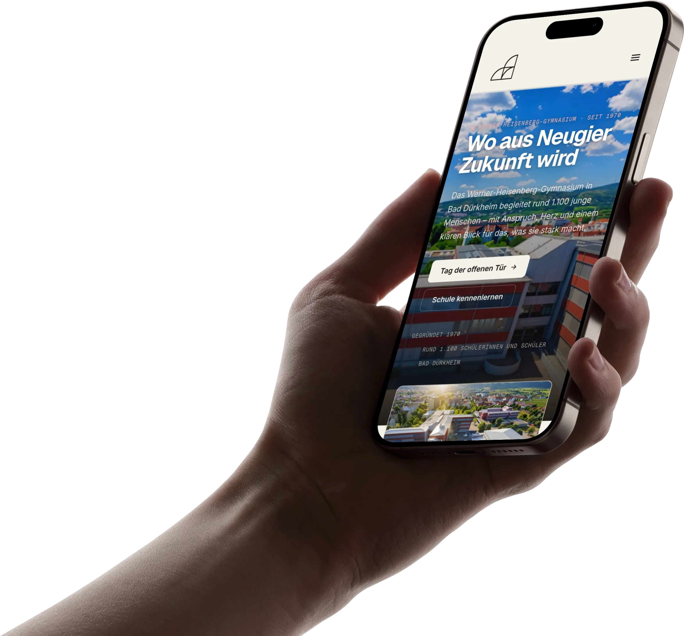
Responsive
One presence, every device.
From the large screen to the phone in your hand: structure, calm and readability remain – only the arrangement adapts.
The centrepiece
A common thread – literally.
The mission-statement section presents the school’s three defining strengths – languages, trips & exchange, music & culture. The client’s wish: something playful, a line that runs along as you scroll. That became the section’s central metaphor – the red thread. In German, “der rote Faden” is the connecting leitmotif, exactly what a mission statement is about.

The wine-red line is a single SVG curve that draws itself as you scroll – at the pace you read. What makes it special: it is not drawn in a fixed way but computed live from the real geometry of the page. The script measures the actual positions of text lines and images and constructs the path so that it winds around texts and images instead of running through them – with small, handwriting-like loops in the free bands in between.
Built robustly: a check script samples hundreds of points along the line and ensures that it never cuts through text or image at any screen width – if space is tight, it automatically takes a calmer route. With “reduce motion” it lies still, on mobile it is hidden, and without JavaScript a subtle static line appears.
Insight
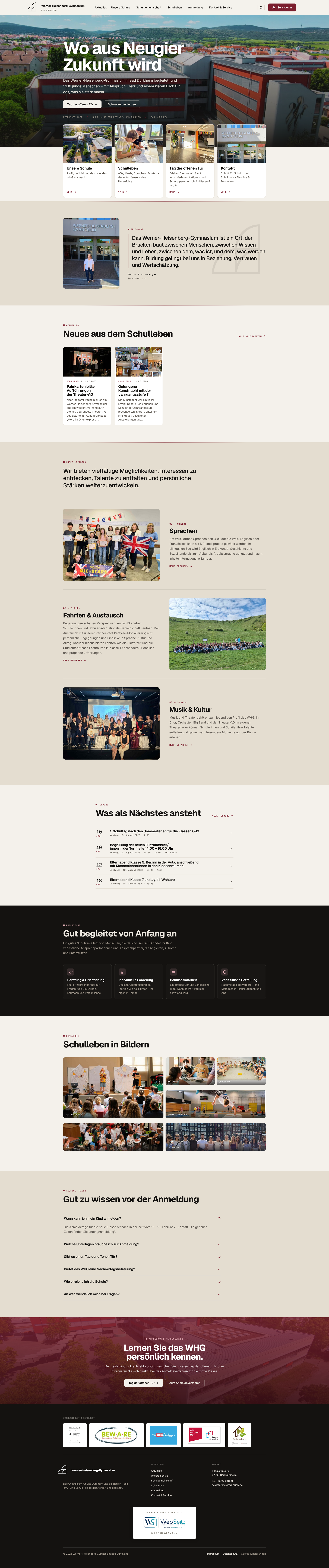
The home page in full
Hover over the image – the view slowly scrolls through the entire home page, from hero to footer.
Built for the editorial team
Maintainable by the school – without fear of breaking something.
The most beautiful website is of little use to a school if only the developer can change it. Maintainability was therefore not a side issue but a design goal.
-
Everything important without code
Hero, portal cards, welcome message, the mission-statement strengths – controllable via the WordPress Customizer, with live preview.
-
A tailored editor role
The editorial team can do exactly what it needs. Technically sensitive areas are locked – nothing can be taken apart by accident.
-
Editor = finished page
Fonts, colours and spacing of the front end are mirrored in the editor: true WYSIWYG, no surprises after publishing.
-
Dates & colours in the dashboard
The editorial team creates new event categories including their colour themselves – with a colour picker, without a developer.
-
Self-adjusting elements
Image captions automatically become cards; the mission-statement line recalculates itself when texts change.
-
Instructions without jargon
An illustrated step-by-step guide for teachers – including how to shrink images before uploading.
Solidly built
Secure, fast, accessible.
For a school, data protection is not optional but mandatory – it concerns the data of children and young people. The foundations are correspondingly careful.
-
Two-click solution
Maps and videos load only after active consent. Until then: no data to third parties, no cookies, no tracking.
-
Content Security Policy
A deliberately tight list of permitted embed sources – switchable from observing to enforcing.
-
Delivered lean
Modern build with Vite: bundled styles and scripts in the low double-digit kilobyte range.
-
No layout jumps
Image areas are reserved via aspect-ratio – nothing jumps when loading.
-
Accessible
“Reduce motion” respected, semantic structure, keyboard operation, visible focus.
-
Works without JavaScript, too
Progressive enhancement: the animations are the icing, not the structure.
Measurable
The result
The outcome is a website that achieves three things that are often at odds with each other: distinctive and detail-driven in design, technically solid, fast and privacy-compliant – and yet maintainable by people without a technical background.
- A distinctive design with a custom WordPress theme instead of a website builder
- Maintainable by the school itself – with a true WYSIWYG editor
- Privacy-compliant with a two-click solution for external content
- Fast loading times, no layout jumps
- Accessible and usable without JavaScript
- The scroll-linked thread animation as an unmistakable centrepiece
What the client says
For the creation of the new website of the Werner Heisenberg Gymnasium in Bad Dürkheim (www.whg-duerkheim.de), we could not have wished for a better partner than Mr Seitz. From the first idea to the launch, everything simply fell into place.
Working with him was friendly and absolutely reliable. Mr Seitz was available at all times, worked incredibly fast and patiently and promptly implemented even our numerous change requests. We were particularly impressed by his feel for design and for the effect a website has. He contributed many ideas of his own and turned them into a modern web presence.
We were also in excellent hands technically. Everything was explained clearly, so we always knew which options existed and why certain solutions made sense. After completion, we also received an excellently structured manual, which makes it easy to maintain content ourselves without any special prior knowledge.
Many thanks for the wonderful collaboration, the great commitment and the patience with our many change requests. We are thoroughly satisfied with the result and can recommend Mr Seitz without reservation.
Does that sound like a project you would like to start, too?
Tell me what you have in mind. Free, without obligation – a reply within 24 hours.
Or write to me directly: kontakt@webseitz-webdesign.de